
The Illustrative Adventures of Sootie Doodles
Monday, 21 November 2011
Friday, 10 June 2011


Thursday, 9 June 2011
Monday, 6 June 2011


Saturday, 4 June 2011


Wednesday, 18 May 2011
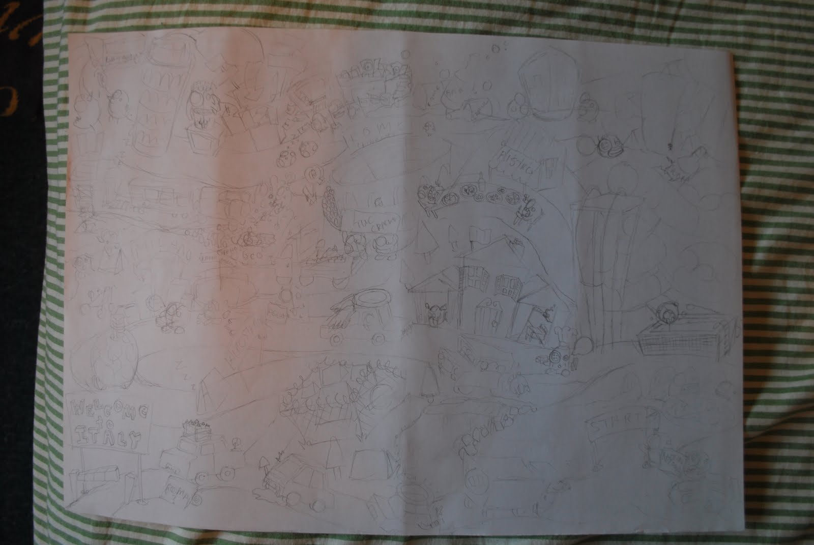
Munich Coloured 2


Sunday, 15 May 2011
Bibliography
https://blogger.googleusercontent.com/img/b/R29vZ2xl/AVvXsEhHKxngougte9qgedzYg2eHCPFWsv5Jht2Bhu0bETjnSrcdl2_K10qGP91_o5bPJSS04j38Z3IyRZh3aI5STZRg9ZkzGYvA62pyZ3iqKZ20FS09Koy0Bpzpr3npci_UB1YY7-96wHbAxMtg/s1600/thumbs_12.jpg
http://gizmag.eu/pdfmag/
http://habbenink.com/
http://issuu.com/
http://picfor.me/en/viewimg/102566
http://www.stumbleupon.com/su/9QCl1v/weheartit.com/entry/7440618
http://www.tugboatprintshop.com/PRINTSHOP_DeepBlueSea.htm
http://gizmag.eu/pdfmag/
http://habbenink.com/
http://issuu.com/
http://picfor.me/en/viewimg/102566
http://www.stumbleupon.com/su/9QCl1v/weheartit.com/entry/7440618
http://www.tugboatprintshop.com/PRINTSHOP_DeepBlueSea.htm
Conclusion
Well hi there. Unfortunately this is all coming to an end. I have found this whole process of blogging extremely helpful. I no way has it been a burden on my mind as something more that I have to do. This blog has helped me keep up to date with my work, it allows me to view everything from a distance and to keep to my goals. It is very easy to go off on a tangent or forget what you are aiming for but when constantly being reminded of what you have already done, who you have looked at and so on it keeps everything in perfect perspective. As for the F.M.P i feel so far it has gone extremely well! I'm really pleased with the work I have done and I really think that this blog has played a large part in achieving this. Unfortunately as the hand in for this blog is 2 weeks ahead of the F.M.P hand in there are a few things that you will have to wait till the show to see but it can be a nice surprise. My time management is usual something i would say could improve when i write a conclusion on most of my projects, however I think that not so much for this one. I'm really pleased with the way everything worked out and hopefully my hard work, good communication and a little bit of luck will pay off. In this project I have explored new techniques and settled on some good ones. In the previous project I felt that I found my style, which i had been looking for, for a while. In this project i felt i really settled into my style and developed it. If nothing else i think i have come away from this course with a lot more skill and confidence than I went in with. It is sad to see the course ending but i feel i have achieved what i wanted from it. This project especially has been the highlight of my 3 years on the course because of my improvement and my devotion to it during the project. I hope you enjoyed my blog and I hope you like my finals. And thanks for taking the time to read all this.
Presentation of Finals

Video Diary on youtube
http://www.youtube.com/watch?v=cFS__gbnFl8&feature=mfu_in_order&list=UL
As the videos have been tempremental at time I have put them all on youtube incase they start playing up, you can find all my video diaries here. just click above the video where it says 27 videos. and you can view them all there. Enjoy
As the videos have been tempremental at time I have put them all on youtube incase they start playing up, you can find all my video diaries here. just click above the video where it says 27 videos. and you can view them all there. Enjoy
Final Video Diary (A recap or the entire project, Very imporant!)
http://www.youtube.com/watch?v=9KR_5WByJmE
http://www.youtube.com/watch?v=dA9qLJJCsKg
http://www.youtube.com/watch?v=0wvEsauQPSs
Having done this it seems like kind of a smart plan to just back up all my videos on youtube in case you have trouble watching them as they have been temperamental before. So i shall pop a link somewhere to my youtube channel where you should be able to find all the videos. Enjoy
Final Blog Update


Final Scans


Development Of Finals


Starting the Finals


Italy Colour Tests


Munich Colour Tests


New Work Space.

Portfolio Images


Friday, 6 May 2011
Thursday, 5 May 2011
More Influences
http://www.tugboatprintshop.com/PRINTSHOP_DeepBlueSea.htm
This is a website showing and selling work by a screen printer called Paul Roden. I am a big fan of his use of colour. The way he overlays and uses limeted colours gives the image a very organic look. I would like to use screen printing as a technique for my final images but i thing they may be too detailed and also it is a technique i have used quite frequently and I think it would be better to explore different methods. However i would like to use similar effects that he has such as the overlapping of colours and possibly involve some stenciling in my images,
This is a website showing and selling work by a screen printer called Paul Roden. I am a big fan of his use of colour. The way he overlays and uses limeted colours gives the image a very organic look. I would like to use screen printing as a technique for my final images but i thing they may be too detailed and also it is a technique i have used quite frequently and I think it would be better to explore different methods. However i would like to use similar effects that he has such as the overlapping of colours and possibly involve some stenciling in my images,
Doodling

Influences and Inspiration

http://gizmag.eu/pdfmag/
Outside Work
Something has popped up out of the blue for me which is rather exciting. Last year one of our projects was to create a childrens book. I did this with a series of nonsense poems that i wrote and illustrated. towards the end of the project i sent samples of the book off to several publishing companies just in case. Over a year later I have heard back from a company called
 who have said they would like to talk about publishing my book "No Explanation Required" So I have also got a lot of work to do with that and I am hoping to get it published.
 This is a slightly cropped image of the front cover of the book i am hoping to get published.

Subscribe to:
Comments (Atom)